IQOO Neo10 & Z10
There's a particular kind of challenge in shooting one campaign that has to speak two completely different languages at once. iQOO handed over a brief for twin devices, the Neo10 and the Z10, and asked for two distinct worlds under one launch umbrella. That's not a request to phone in. That's a request to build.
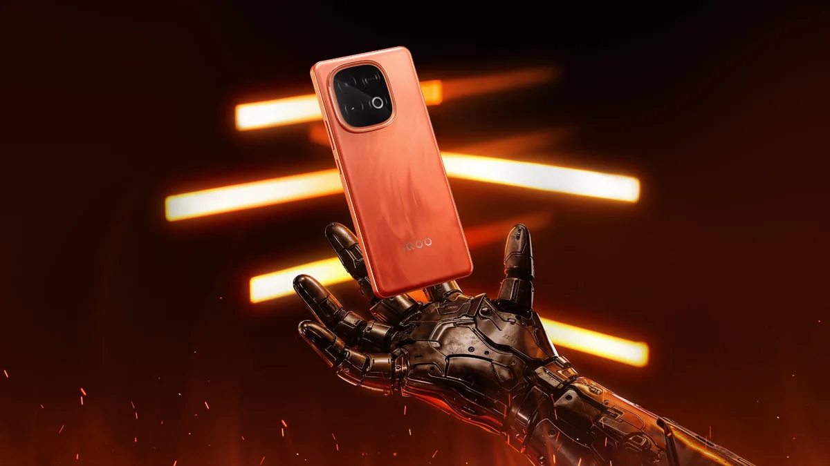
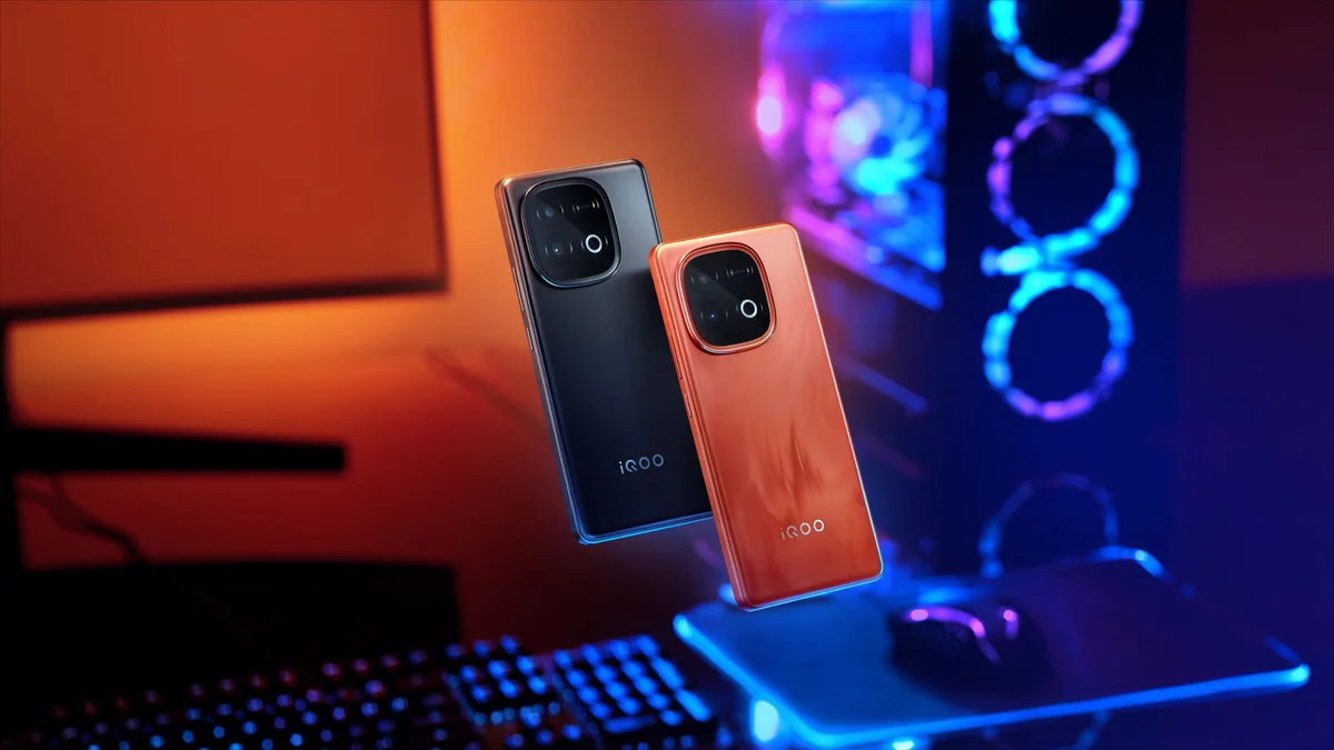
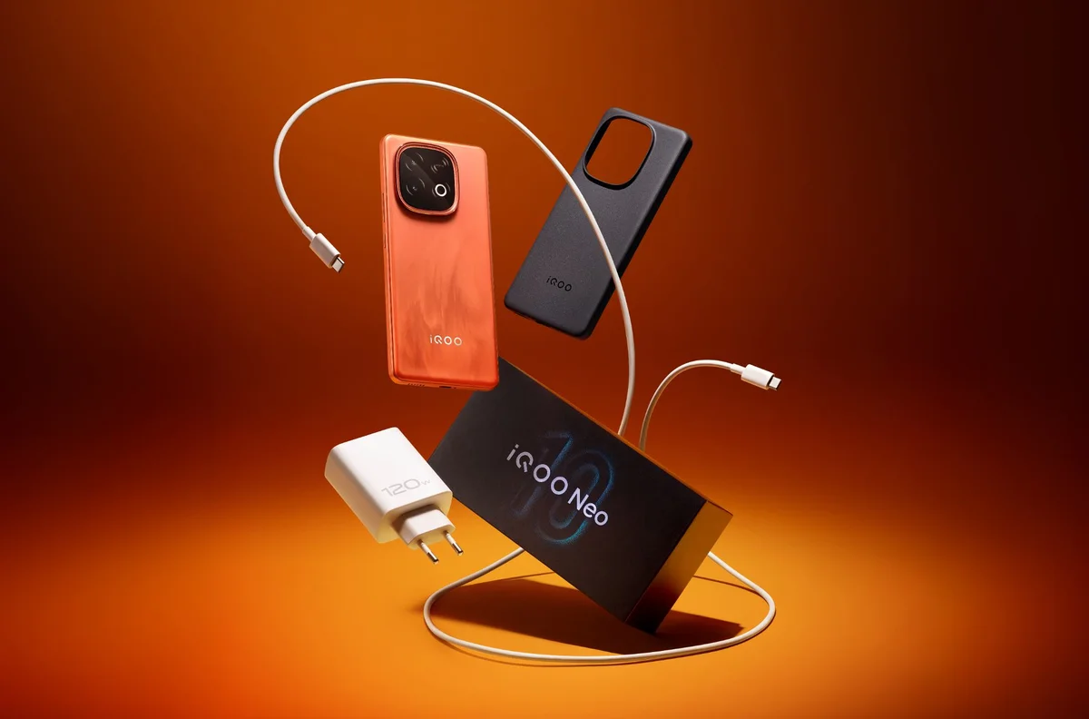
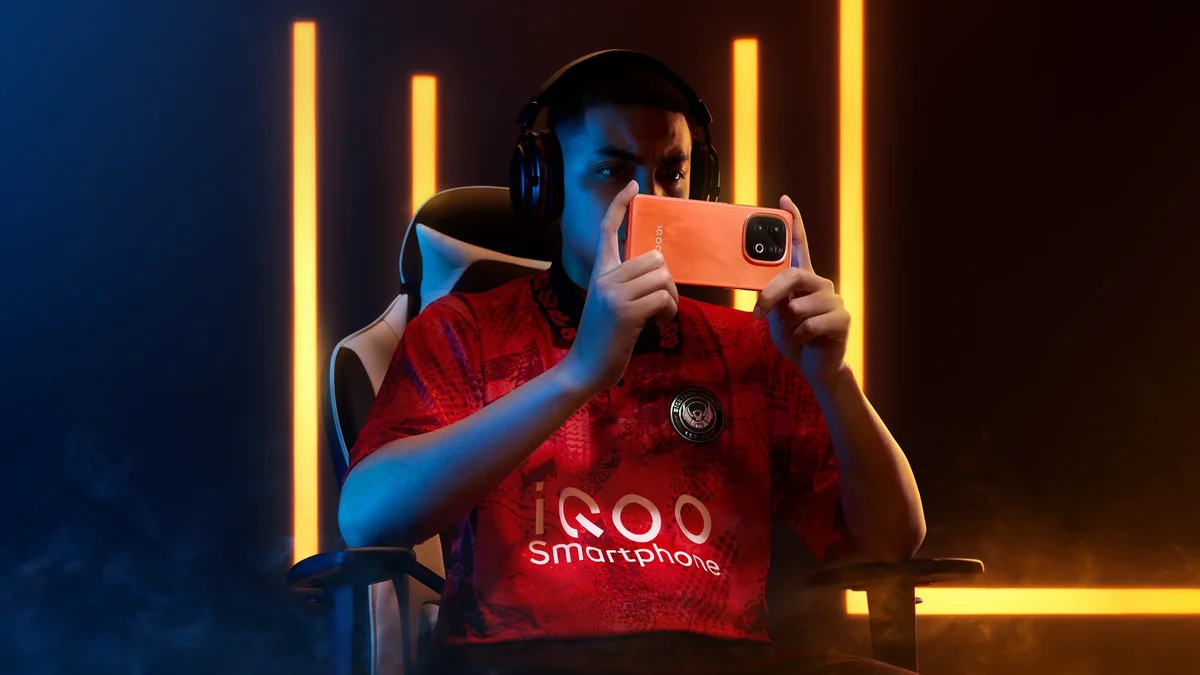
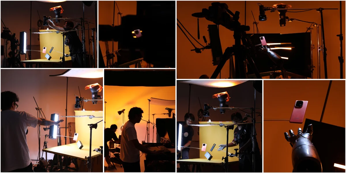
The Neo10 came first in my head, mostly because its mood was so loud it was impossible to ignore. Orange and black, tuned for the e-sports crowd, built to feel like the inside of a gaming tournament. I wanted heat and friction in every frame. Cyberpunk lighting, hard neon lines cutting through darkness, the kind of glow that makes a product feel alive rather than posed. For the talent shots, I pushed for something almost cinematic, a player mid-focus, headset on, the world reduced to a screen glow and adrenaline. The table-top sets needed that same tension, so I brought in robotic hand props and a gaming rig layered with keyboard, mouse, and headset, all soaked in that signature orange wash. Even the unboxing sequence had to move like a highlight reel, components flying out of frame, caught mid-motion against a limbo backdrop lit in warm amber.
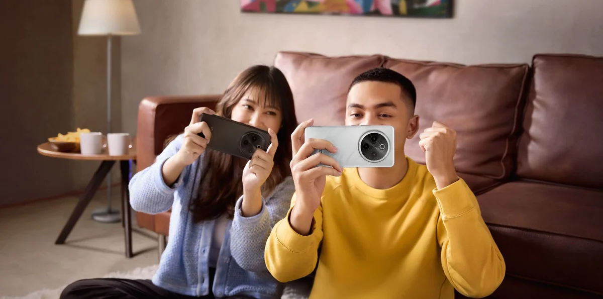
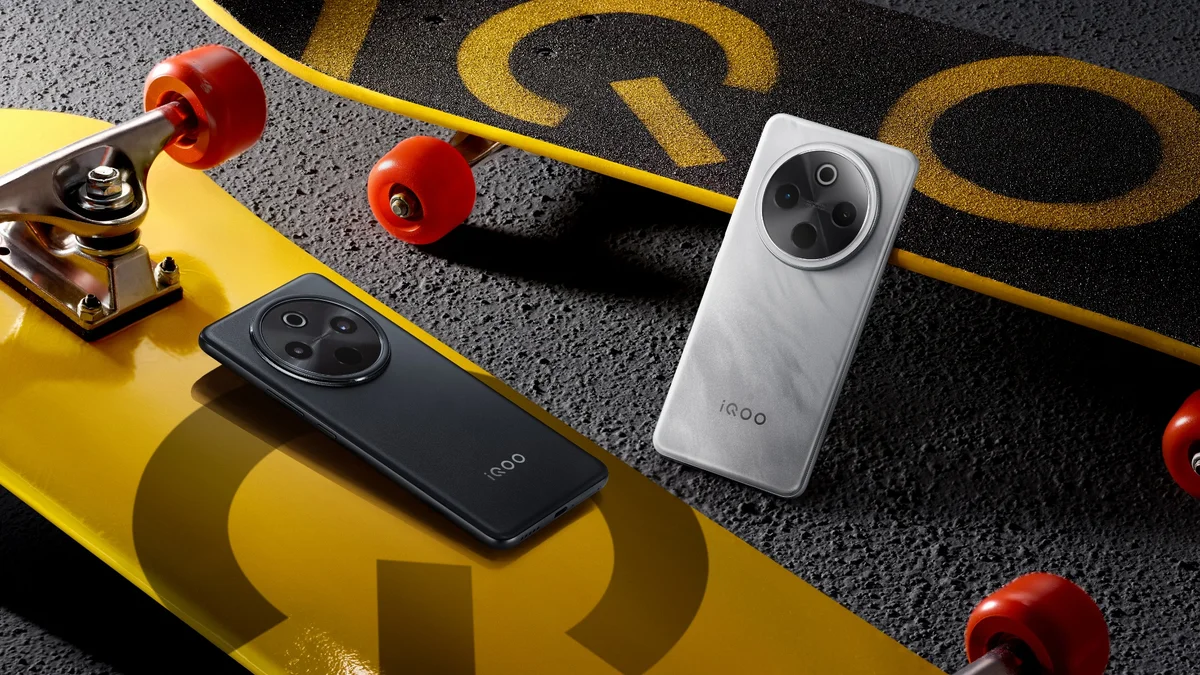
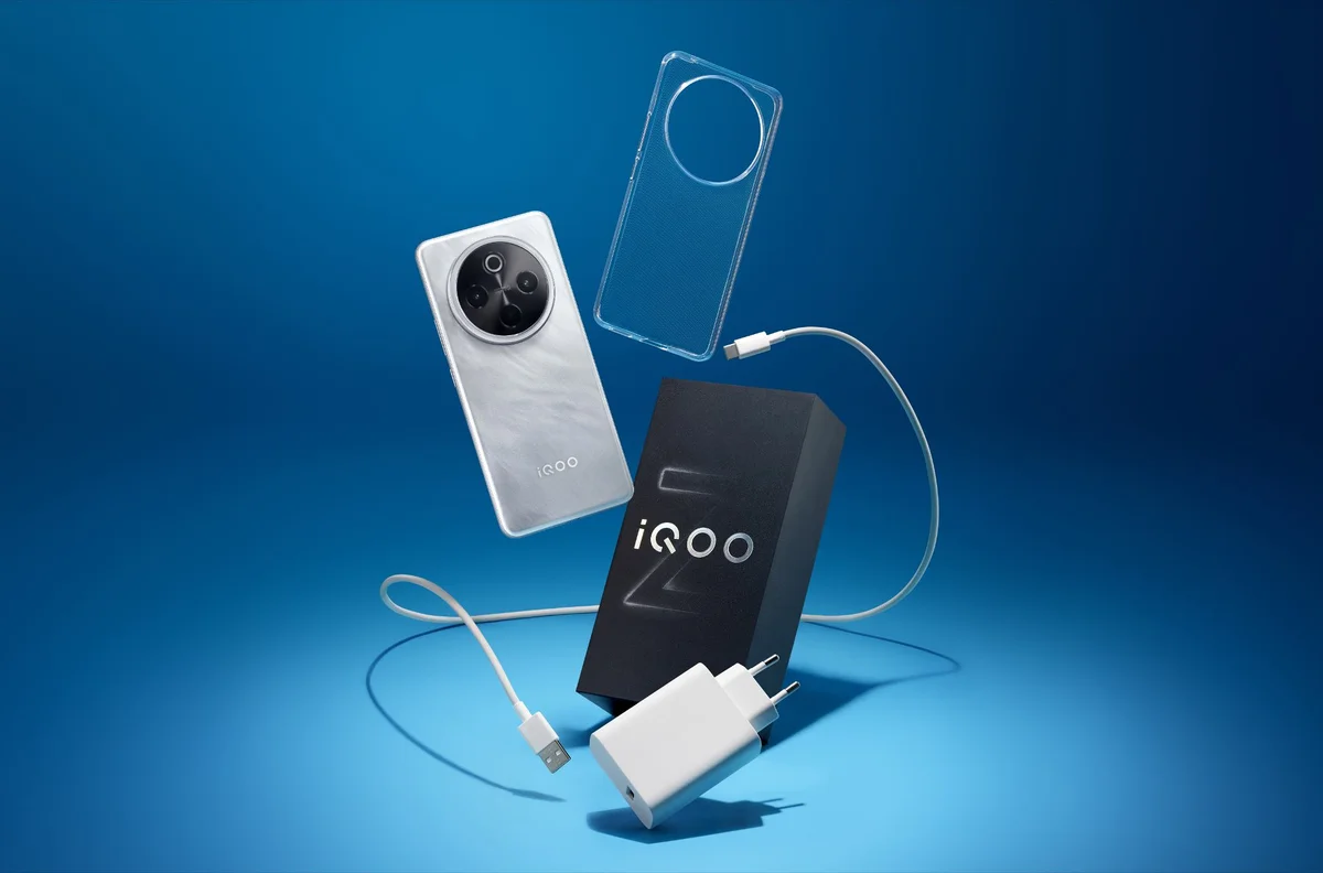
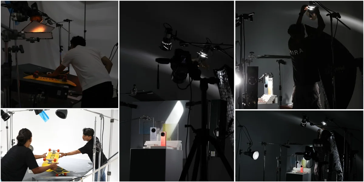
The Z10 asked for the opposite instinct entirely. Silver and black, aimed at the casual gamer rather than the competitive one, this device needed restraint. Where Neo10 shouted, Z10 had to feel considered. I built its world around lifestyle textures, a living room sofa, an afternoon of scrolling, someone slouched into a couch with the phone in hand and nowhere urgent to be. The mood brief was clear on this point: not too dark, not too moody, just comfortable. For the table-top set I leaned into cleaner staging, soda cans, skateboards, sunglasses tossed on asphalt, everyday objects that place the phone inside a life rather than a studio. Its unboxing sequence swapped the Neo10's fiery orange for a cooler blue limbo, keeping the two product stories visually separate even as they share a campaign spine.
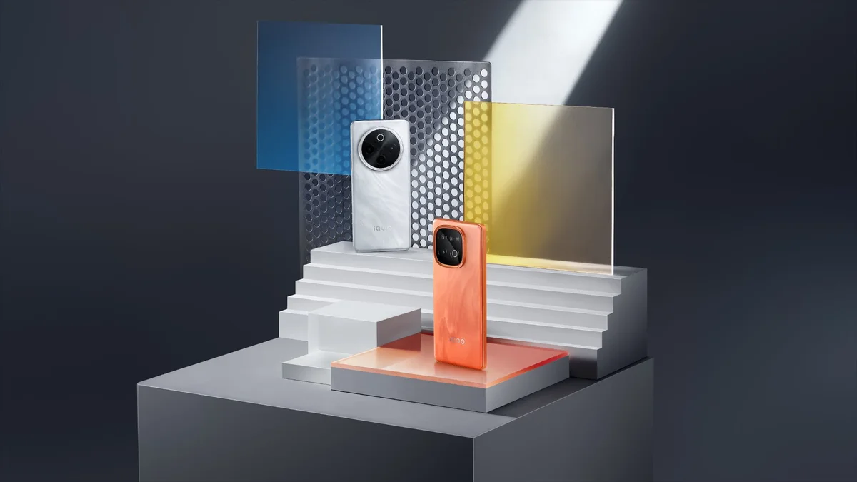
Bringing them together was its own puzzle. The hero shot needed both devices in frame, materials layered like the reference decks demanded, masculine in tone but still legible as two products with two different personalities. That's the shot where the whole campaign has to make sense at a glance, orange energy and silver calm sitting side by side without one undercutting the other.
What made this project satisfying wasn't just the lighting or the props. It was holding two aesthetic systems in my head simultaneously and trusting that the discipline of pre-production, mapping every set, every prop, every color story before a single frame was shot, would let both worlds hold their own on launch day.
Prayogo Yoedo
Advertising photographer of HIRA Imaji, Jakarta.